Profile Chart
Heatmap
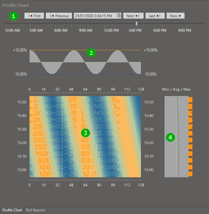
Profiles are rendered as heatmaps with color coded height data. The following image shows the center of the main application window with the chart displaying test data (a date and time watermark is imprinted into the test data at different heights compared to the remainder of the sine-wave-like data).

( 1 ) Date and time selection area
- Press the “First” button to display the oldest data in the selected profile (or selected roll).
- Press the “Previous” button to step backwards in time.
- Use the date/time selector to jump to a specifc date and time.
- Press the “Next” button to step forwards in time.
- Press the “Last” button to display the latest data in the selected profile (or selected roll).
- Press the “Now” button to track the current time and display new data in the selected profile (for any roll). This will poll the database in regular intervals to retrieve latest samples.
- Use the daytime slider to move across different times of the day.
( 2 ) Top chart
The top chart displays a lateral view across the width of the profile, either for the samples shown across the top of the heatmap (3) or, if an interactive cursor is used, it will display the view across the width of the profile underneath the cursor. The horizontal orange line refers to the configured high level mark, the green target line refers to the configured target, and the blue line refers to the configured low level mark, with height differences from the target value renderered above or below the target line. If height differences exceed the limits then the chart will display different colors. In the example, all sample heights are within limits resulting in the gray sine curve (the test data is a sine wave).
( 3 ) Main chart
The main chart shows profile heights over time. The horizontal axis runs from position zero to the width of the profile. The vertical axis is the time axis, showing samples within a time window; the later time is displayed at the top of the chart. Colors are used to encode the height of each sample, with low values showing in blue color, on-target values appearing in green color and high values showing in orange or red color, with various shades inbetween; see the Chart Legend on the right hand side of the main window for detailed color information.
Besides using the date and time selection area, you can move within the time axis by either left-clicking on the chart and by dragging the chart up and down while keeping the left mouse button pressed, or you can use the mouse wheel to scroll back and forth in time.
( 4 ) Right chart
The right chart either displays minimum / average / maximum values or samples along the time axis for the interactive cursor position (when the interactive cursor is used). The vertical lines in the chart refer to low level, target, and high levels in the same fashion as the horizontal lines in the top chart.
Within the right chart, minimum values are displayed as bars towards the left, maximum values as bars to the right, and average values as a gray line somewhere between the minimum and maximum values. If minimum or maximum values exceed the limits then the chart will display different bar colors. In the example, some maximum values exceed the high limit and are shown in orange color.
Interactive cursor
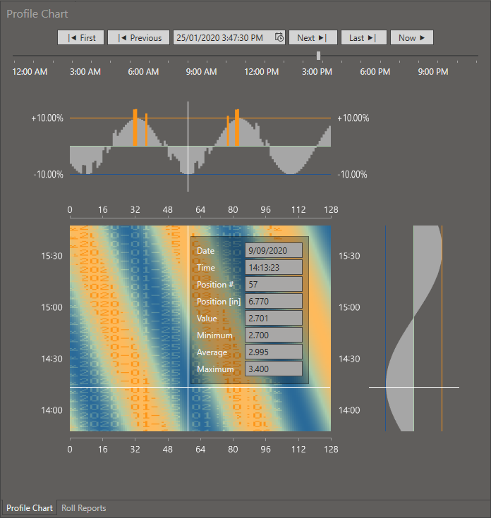
Moving the mouse cursor across the main chart activates the interactive cursor.

White lines are drawn horizontally across the width of the profile and vertically along the time axis; the cursor position is at the cross point of the lines. The right chart changes from the “Min / Avg / Max” display to show the profile along the time axis at the cursor position. An information panel is shown next to the cross point.
The information panel displays the following data relating to the cursor position.
- Date of the sample
- Time of the sample
- “Position #”; the data point index within the profile sample (ranging from zero to the number of array values)
- “Position [in]” or “Position [cm]”; the position in physical units ranging from zero to the physical width of the profile
- The sampled value at this position and time
- The minimum value across the width of the profile at this point in time
- The average value across the width of the profile at this point in time
- The maximum value across the width of the profile at this point in time
Click the left mouse button to temporarily switch back to the “Min / Avg / Max” right chart while still within the heatmap. Move the mouse again to activate the information panel.
Chart Colors
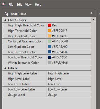
Chart colors may be adjusted by selecting the “Appearance” tab at the bottom left of the main window.

Color changes have immediate effect. Select menu “View / Restore default appearance” to restore original settings.
Export Chart Data
Select “File / Export Chart Data” from the main menu to save the data of the displayed chart to a CSV file.